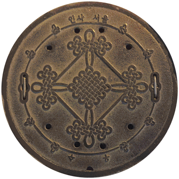
Look Down
This is a compilation of pictures of manhole covers and ground plaques from around Korea. The visual elements of the modern and historical branding gathered from these images serve as a visual ethnographic tool. After documenting these symbols and patterns, inquiry into their meaning can be explored with residents and designers in Korea to determine what, if any, meaning these visual elements have to them. I can start to answer questions like how Western influence has impacted city branding in Korea over time.
May, 2017
I showed some of these findings to Joon Soo Ha, a professor of design at Kookmin University in Seoul. He told me that the design of the figure waving its arms that appears in the center of many manhole covers is part of Seoul’s city branding, and that it was inspired by the 1992 Barcelona Olympic logo. The mark references the international community more than Seoul’s cultural heritage.
The original “city branding” of Seoul that the Japanese created during occupation doesn’t appear on Korea’s government website history of city branding, yet it was a more accurate representation of Korean cultural heritage than the current I•SEOUL•U city brand. Japan developed Korea’s tourism market, and while doing so branded the city through promotional materials highlighting national treasures. Though Japan overstepped its boundaries by occupying and industrializing Korea from 1910–1945, its branded depictions of Seoul for tourism and economic value better represented Korean heritage. At that time, the allure of Korea, a hermit kingdom, was exotic for Japanese and other international tourists.
Found Type and Patterns
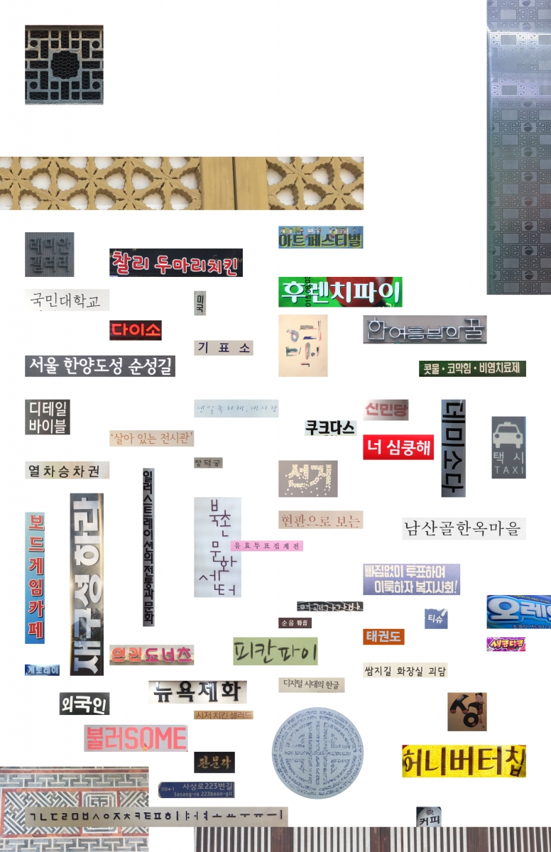
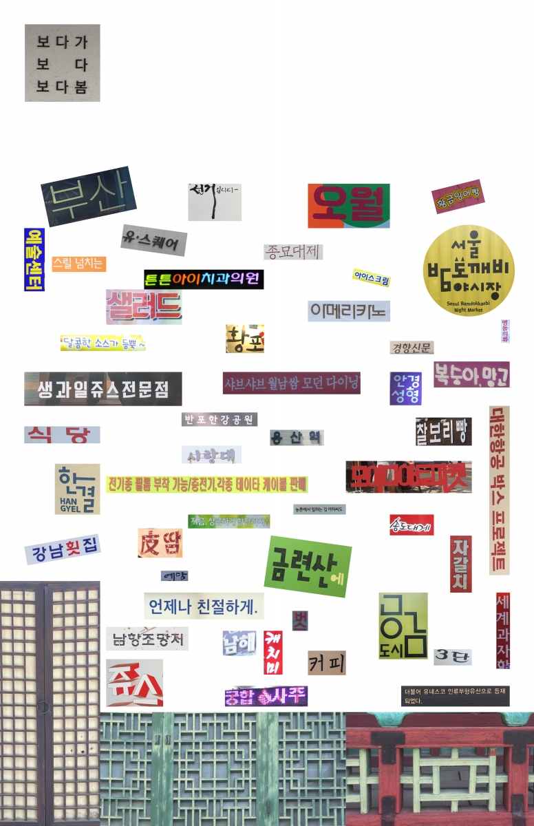
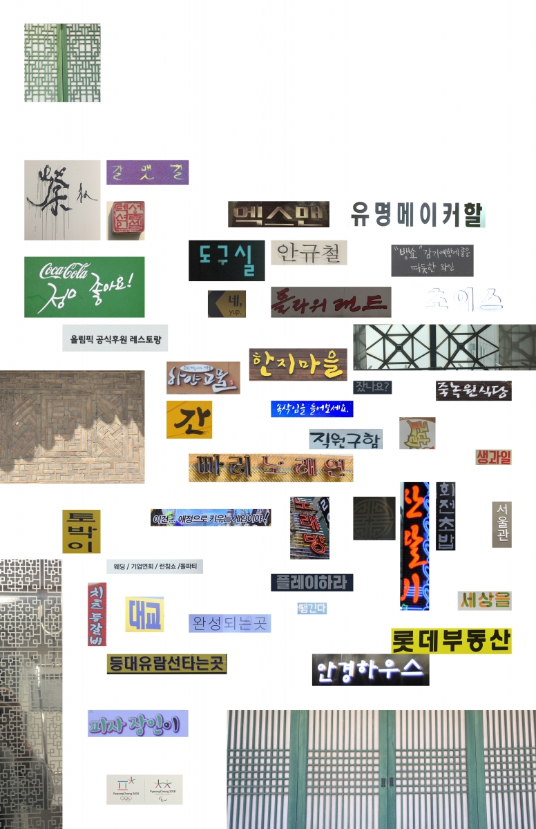
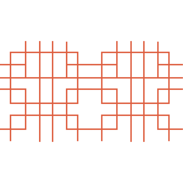
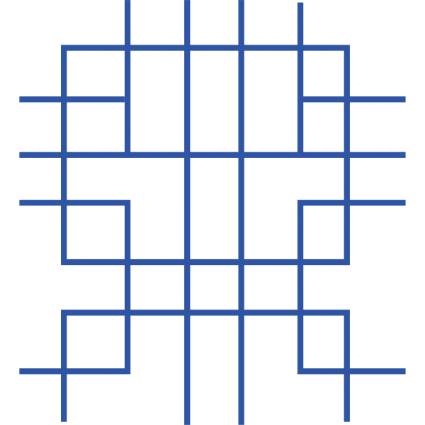
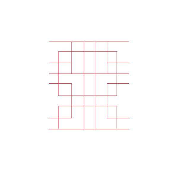
These collages combine images of found type and patterns from around Korea. I collected these from storefronts, advertisements, packaging, and wayfinding signage. By decontextualizing these elements, I can juxtapose a variety of typographic forms and analyze their details and subtleties. Combined, they form a visual record of typography in Korea, from pop culture to convenience store signage. My knowledge of Korean typefaces is limited; so, after gathering found type, I can ask Koreans what meaning individual fonts convey to them.
I find it incredibly interesting to compare the typography and patterns I have found around South Korea with those from the North Korean artifacts in Nicholas Bonner’s book, Made in North Korea. In this book, Bonner examines North Korean culture through graphic design specimens he collected over the course of 25 years.
MOIDA Color Study
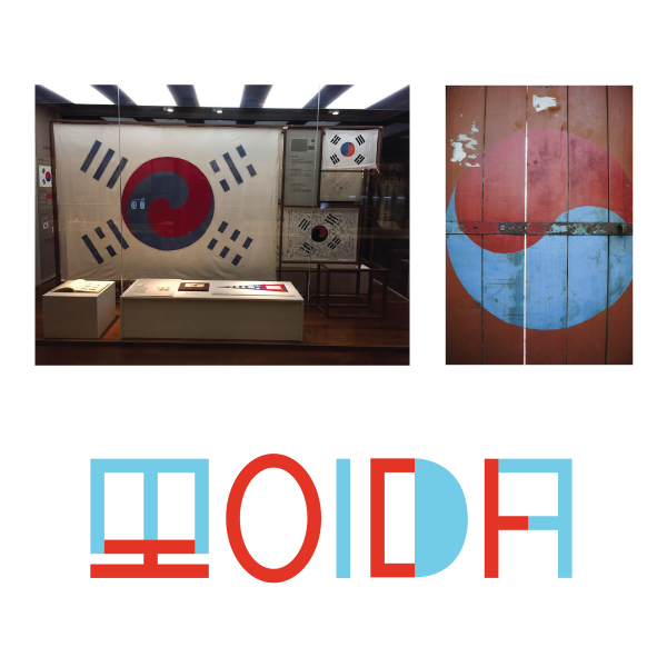
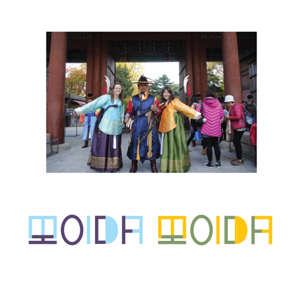
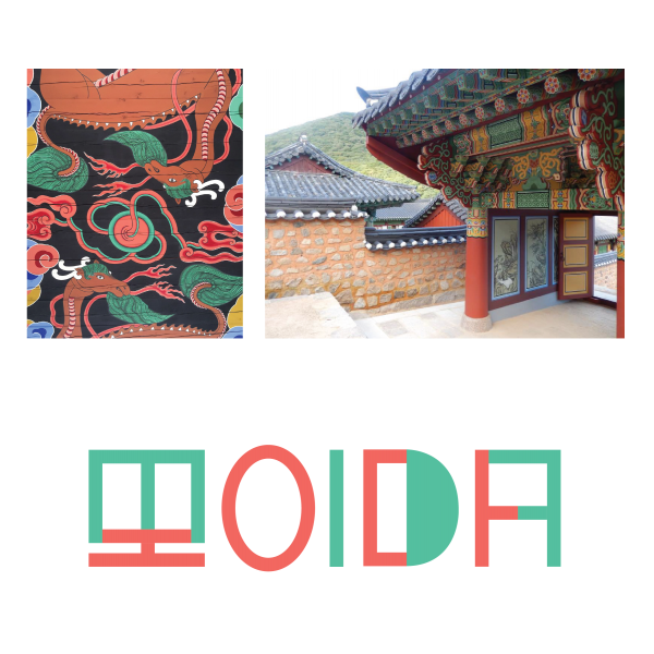
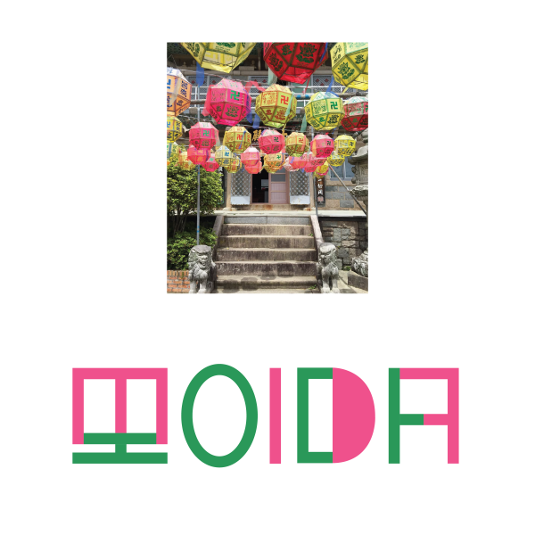
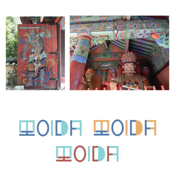
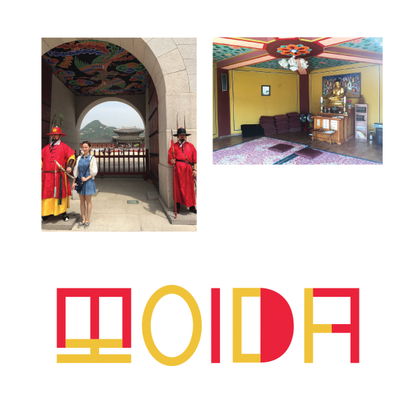
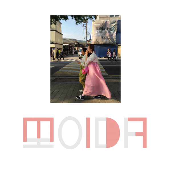
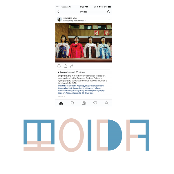
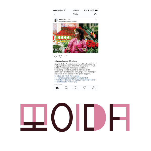
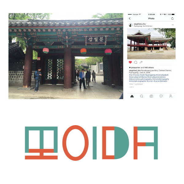
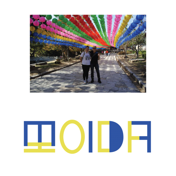
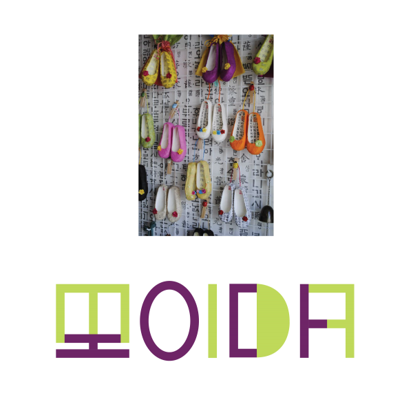
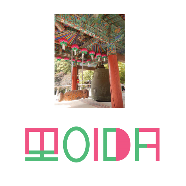
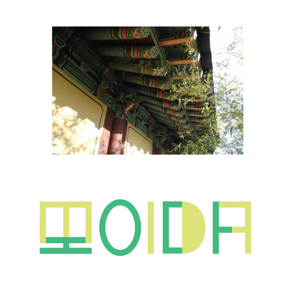
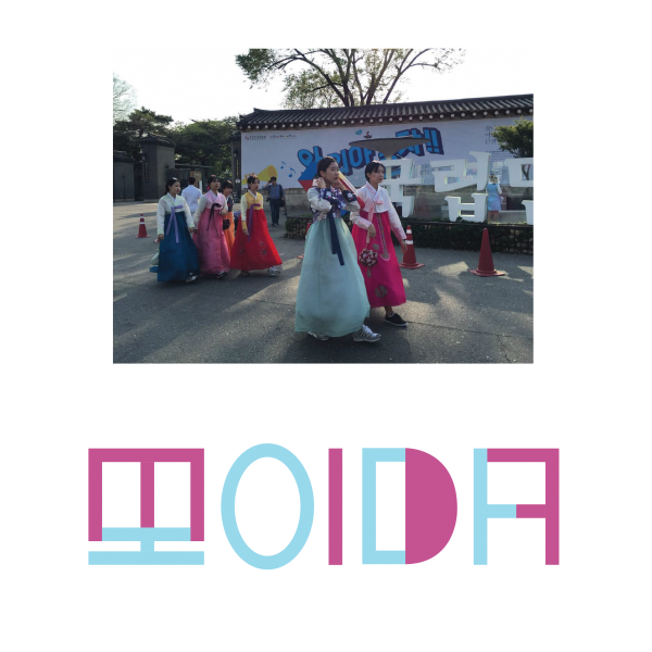
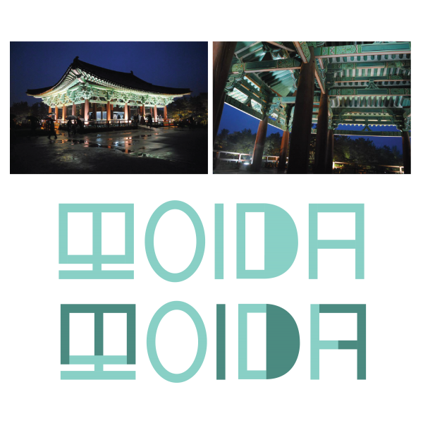

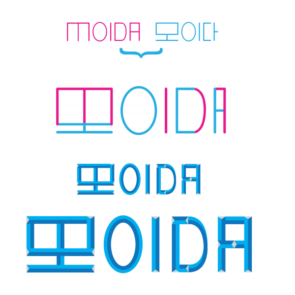
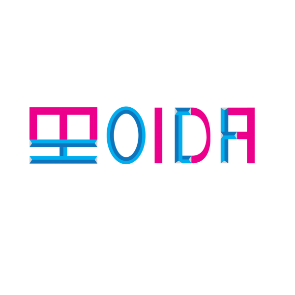
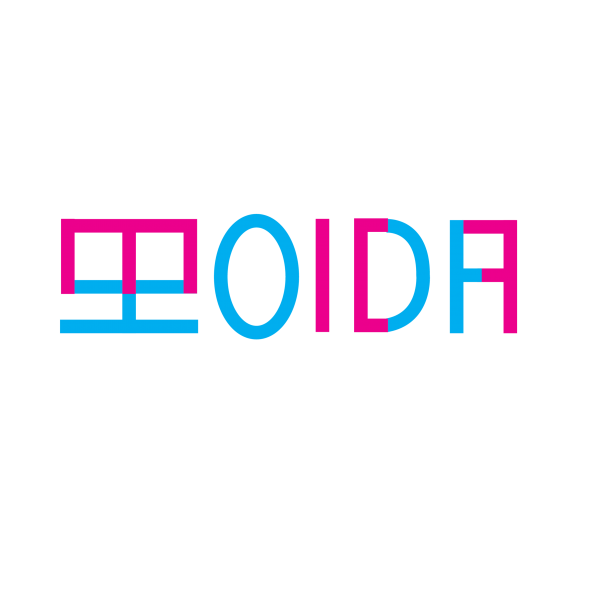
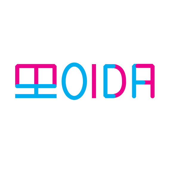
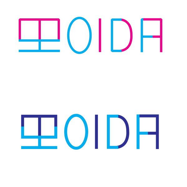
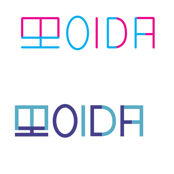
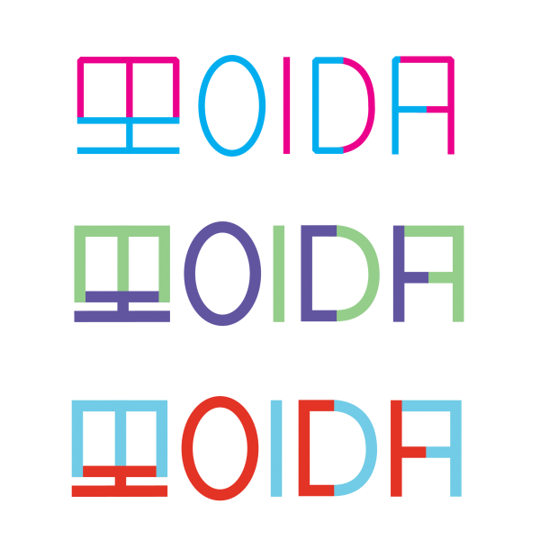
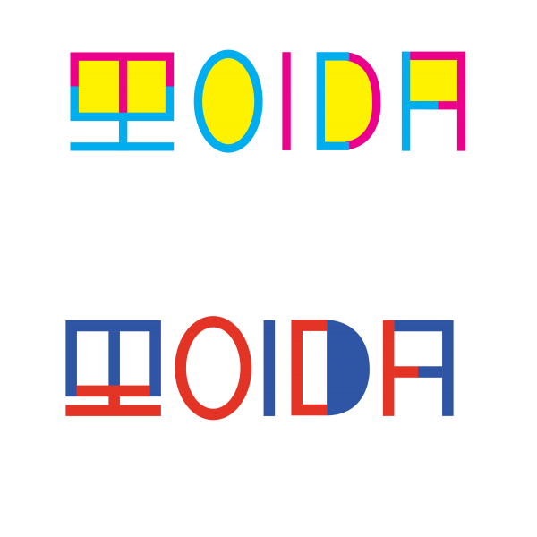
MOIDA (모이다) is the coming together of groups from different parts. To generate a color palette, I conducted a visual ethnography of unifying characteristics of the North and South Korean traditional landscapes–from architecture and patterns to clothing and symbols. I used some of my photos from South Korea, and I referenced North Korean imagery from the few Instagram accounts of photographers, such as David Guttenfelder and Jaka Parker, who have had access to take photos in North Korea in recent years. See the project here.
Painting the Border
These are excerpts from a depth interview with South Korean painter, Minah. She is an M.F.A. graduate student at the University of Florida. She creates abstract paintings with a subject of the North/South Korean border space. Minah talks about an imaginary space that she cannot enter into, yet the birds and the river can pass freely across the border. She depicts this land and its features through colors and shapes.